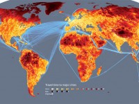

We think Sydney to be pretty remote… However, when you take a look at the map above, it is evident it can get worse, much worse.
The map shows the number of days it would take from a certain location to reach the nearest city (50,000+ inhabitants), without using air travel.
The most remote location in the world lies somewhere in Tibet!
It would take you…only 20 days to travel to the city.
(Source with other cool maps)
On the other hand this would be the place to be if a worldwide plague struck us all (Philip K. Dick style)!
I’d like to see a map representing average number of computing devices per inhabitant + speed of network traffic, see how it correlates to actual physical transport speed above…
Here’s a start: http://www.worldmapper.org/display.php?selected=337
True, but I’m not a big fan of the relative territory changes, sometimes it’s hard to tell the actual measure and how big it is. Probably because i’m bad at estimating 2D sized and sometimes i don’t have a clue of the original territory size 😉
I find many eyes is interesting for visualizations as well. For example Obama’s speech in Cairo